portfolio
We’ve been in business since 2000, so we can’t show you everything we’ve done – there’d be way too much to go through! Below in our portfolio is just a small selection of our recent work. If you don’t see the type of project you’re looking for, chances are we’ve done something like it. Send us an email or give us a call and we’d be happy to chat about finding the right image for you.

Power Plus Hockey Skating
graphic / print
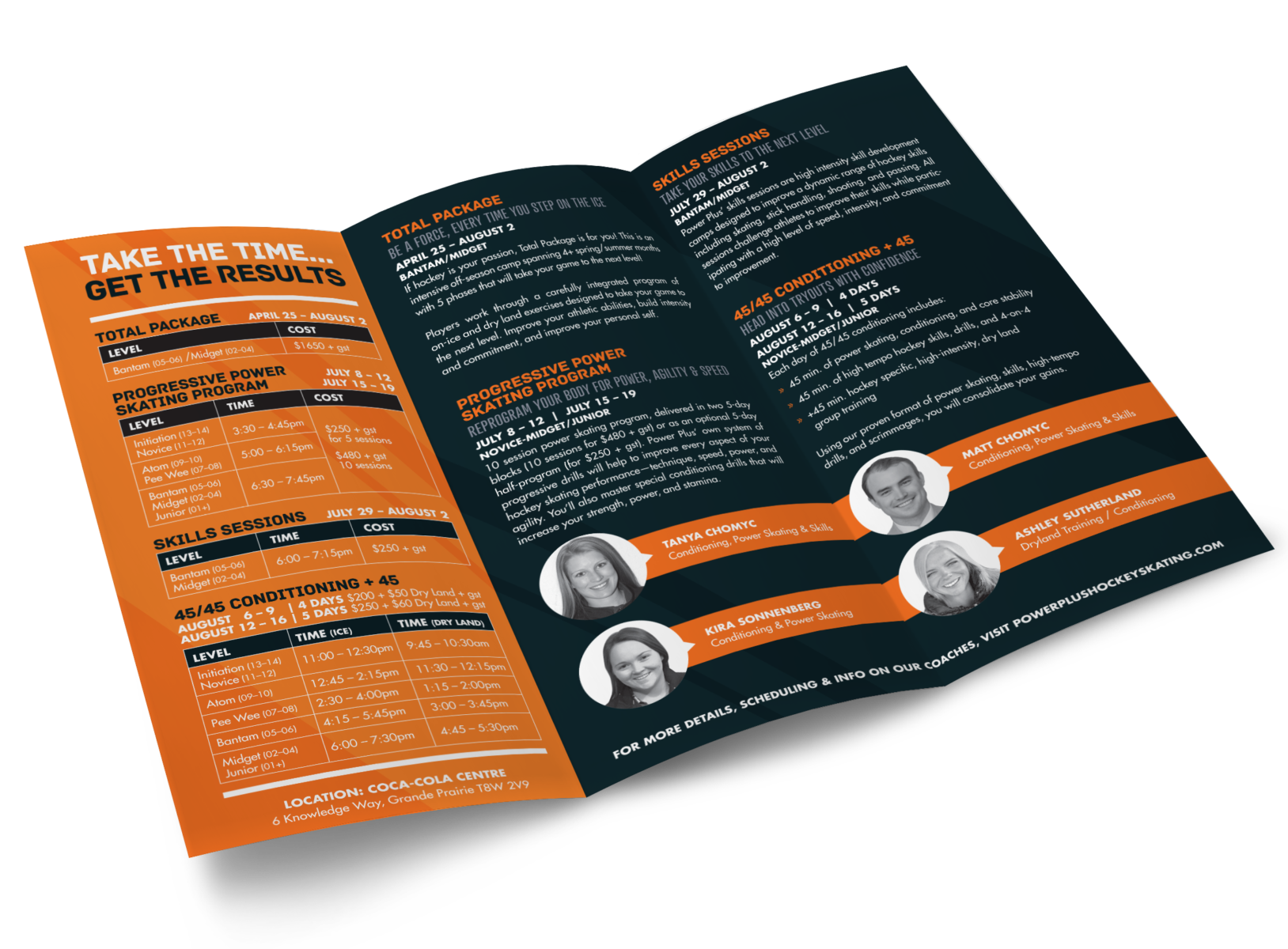
“Be a force, every time you step onto the ice.” The trainers at Power Plus Skating work with children and teens on building their techniques and skills in hockey. Their mission is to boost speed, power, and agility of young athletes. Working with their existing brand, imageDESIGN creates annual posters and brochures that communicate the bold, dynamic energy of the program. Business cards and a pull-up banner match the other materials and are a bright, exciting way to promote the program.

ThreeSixty Analysis Inc
digital print / graphic / wide format print
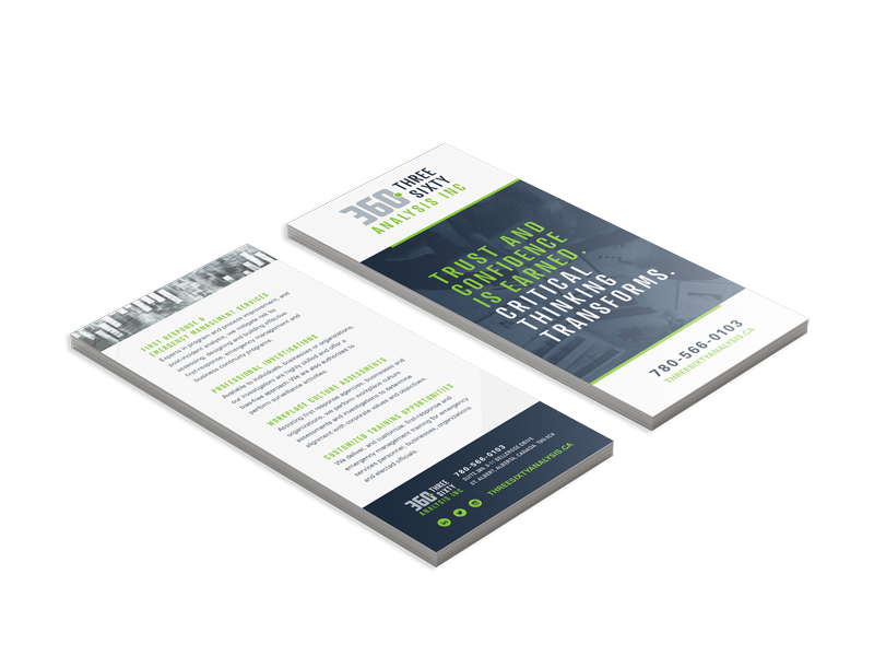
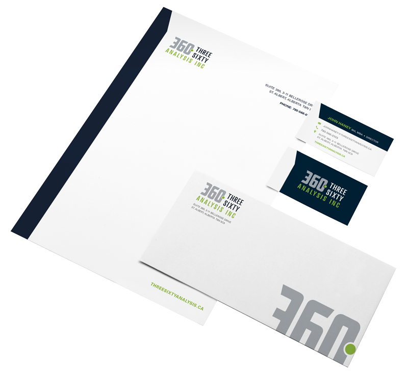
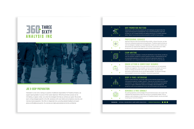
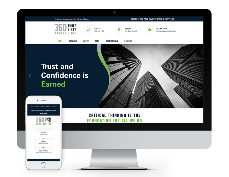
ThreeSixty Analysis Inc specializes in first response and emergency management services across Alberta. They were looking for the total package for their business, starting with a logo. We created something modern with the flexibility to suit all future applications, from merchandise to trade shows. From there, we took care of a total branding package: stationery, pull-up banners, a template website, pamphlets, flyers, social media graphics, a trade show display, and more.
Northern Metalic
web / webPREMIERE
Given Northern Metalic’s ever-growing business across British Columbia and Alberta they needed a multipurpose website available to provide a look at products, blog posts, flyers, and locations just to name a few. With excellent design and development from imageDESIGN, Northern Metalic’s website is eye-catching and built to last!
Growing the North
web / webPREMIERE
Growing the North was looking to update their current website to something clean and modern. Choosing imageDESIGN to design and develop was a clear win as we were able to establish a sleek new look with seamless flow! We took the necessary steps to provide easy access to register to this years virtual conference and future events held by adding a fixed navigation and floating register button on mobile.
Industrial Metalwork
web / webSELECT
Looking to refresh to their existing website, Industrial Metalwork saw the potential that could be had. Naturally we took the creative reigns and developed a stunning new website for them! Select pages feature a parallax scrolling effect and custom button animations to further demonstrate their services and link awareness.
Village of Hythe
web / webPREMIERE
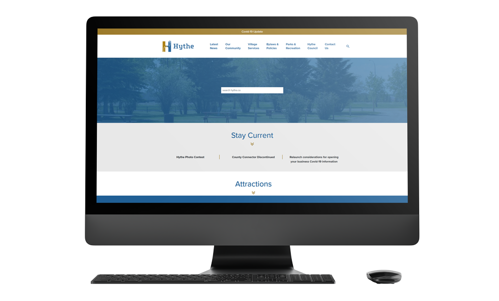
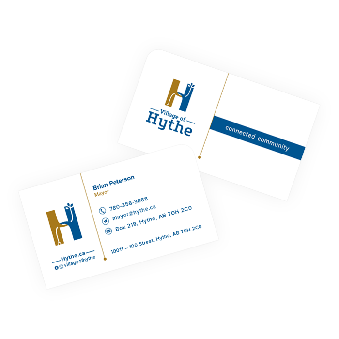
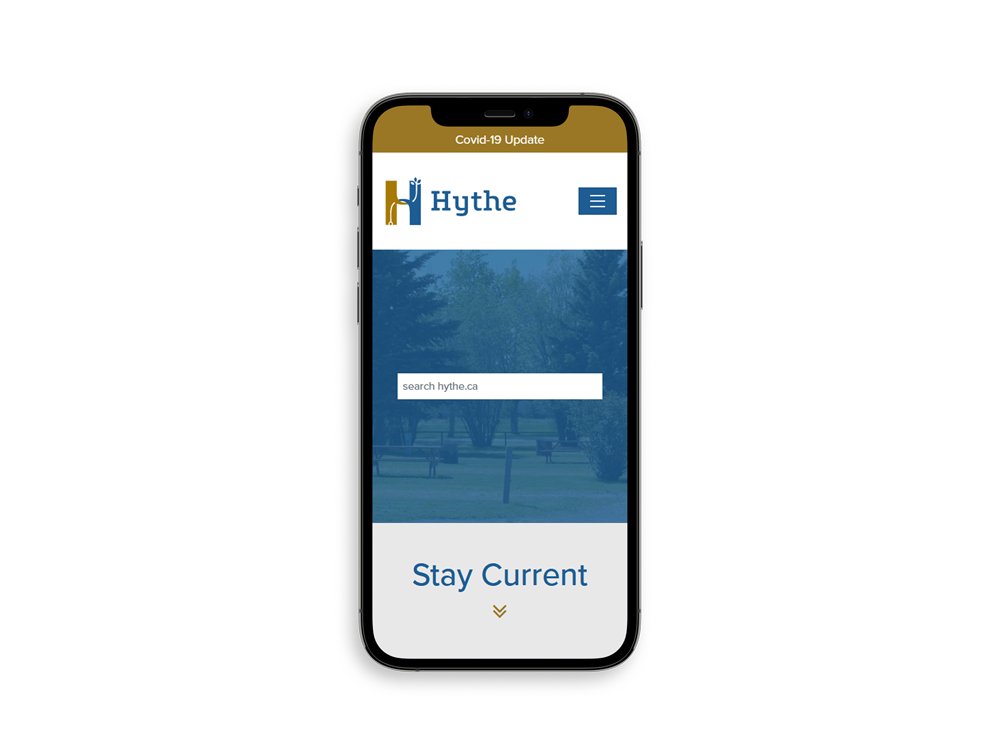
After establishing new branding for Hythe – including a logo, business cards, and signage – we continued on to a new website! This allowed us to custom design and develop a brand new site, showcasing their new branding using key elements including search, simple navigation options, and a clear layout. This allows for a smooth user experience making it easy for anyone to explore and find what they need.
The Centre for Creative Arts
web / webSELECT
The Centre for Creative Arts was in need to modernize their existing website. imageDESIGN created a unique new experience, displaying features such as class registration, member login, event calendar, and newsletter sign up. The new site is polished and perfectly styled to match the artistic tone of The Centre for Creative Arts!
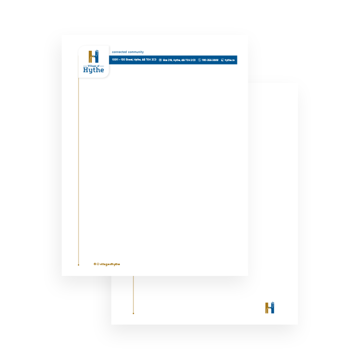
Village of Hythe
graphic / print
The Village of Hythe’s focus is on the residents’ existing community spirit and the opportunity for businesses to establish themselves in Hythe. The icon design is an interconnection of the top and bottom of the “H”. The top part is community, represented by the leaves, and the bottom is the technology and progress, represented by the fiber optic. The use of interconnecting shapes within the icon symbolizes the existing strength and flexibility of the community – the straight edges for the strength and the curved, organic shapes for flexibility. Using a slab serif font echoes the idea of a strong and sturdy community, with some curvature and flexibility in the Village’s growth. The use of blue conveys confidence, intelligence and integrity. Combined with bronze, which represents strength and durability, the logo comes together representing a community holding their residents at heart while confidently moving into a modern direction to grow the community.
Grande Prairie Public Library
special print
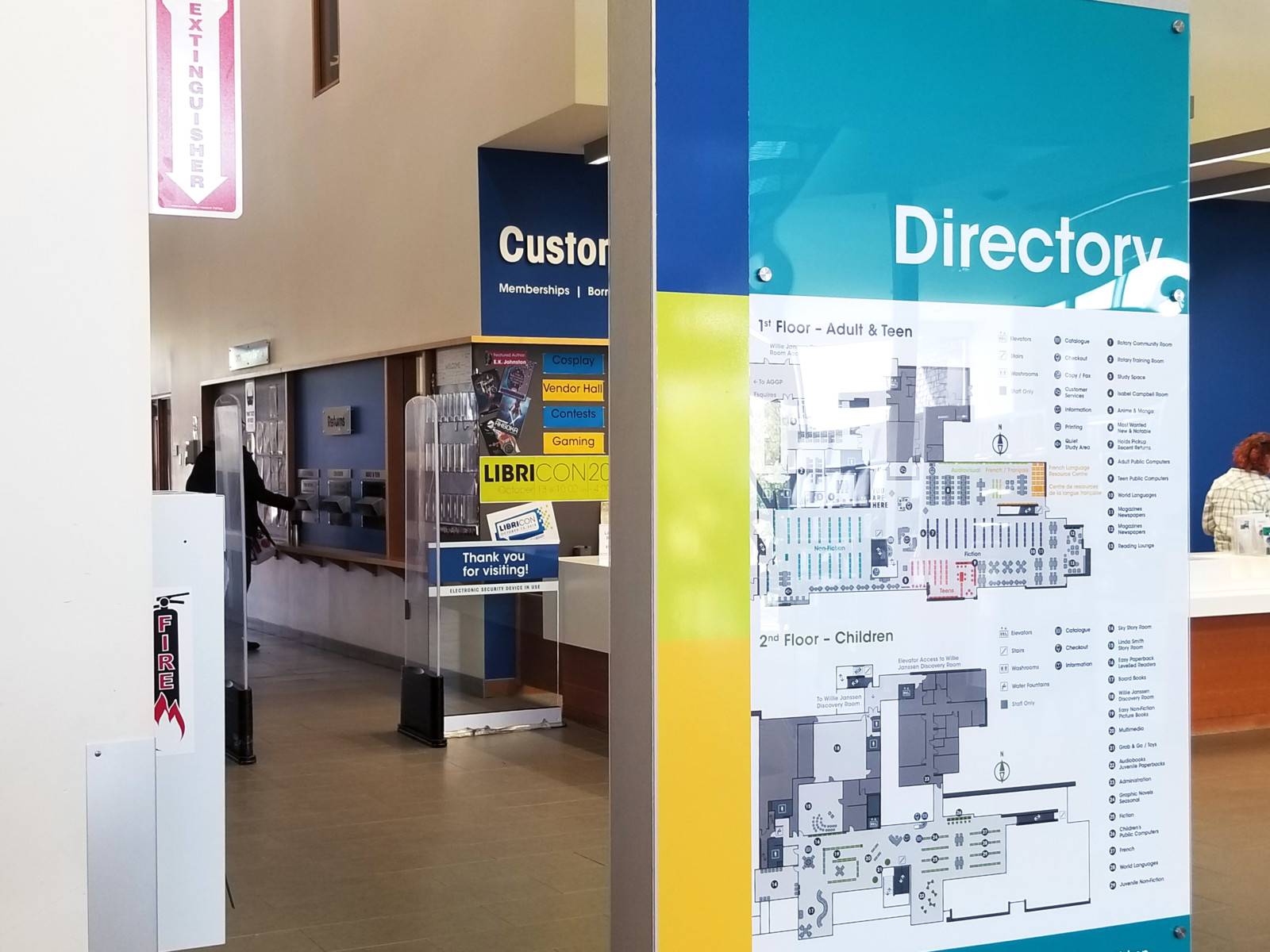
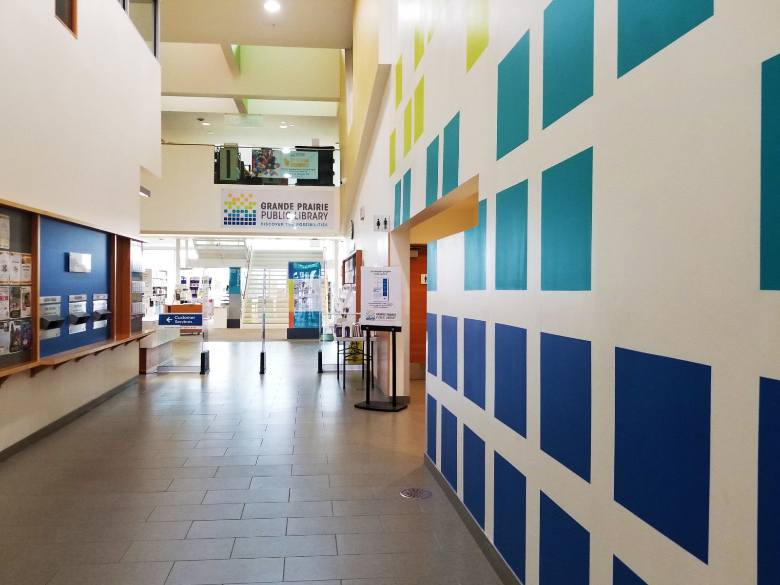
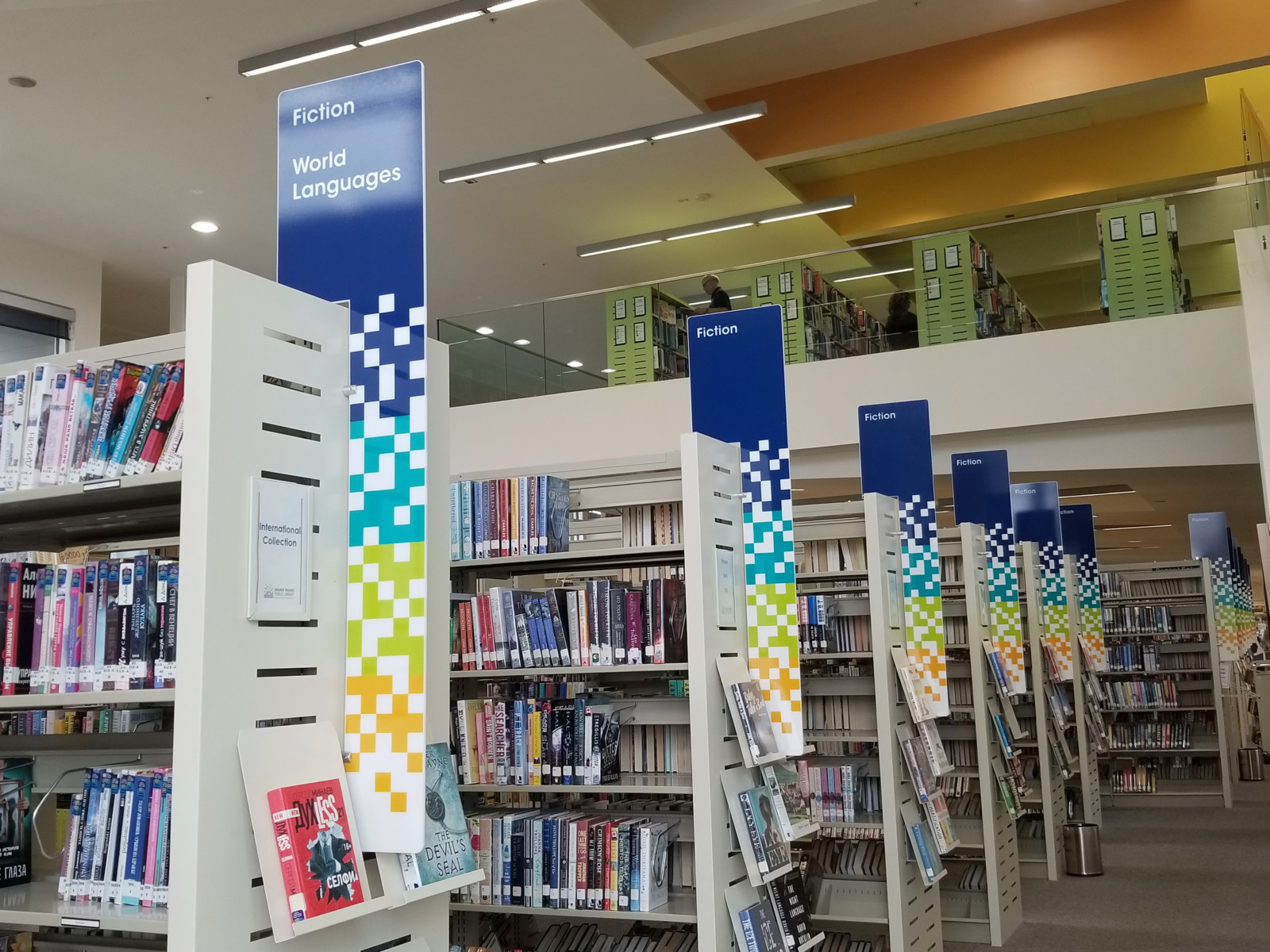
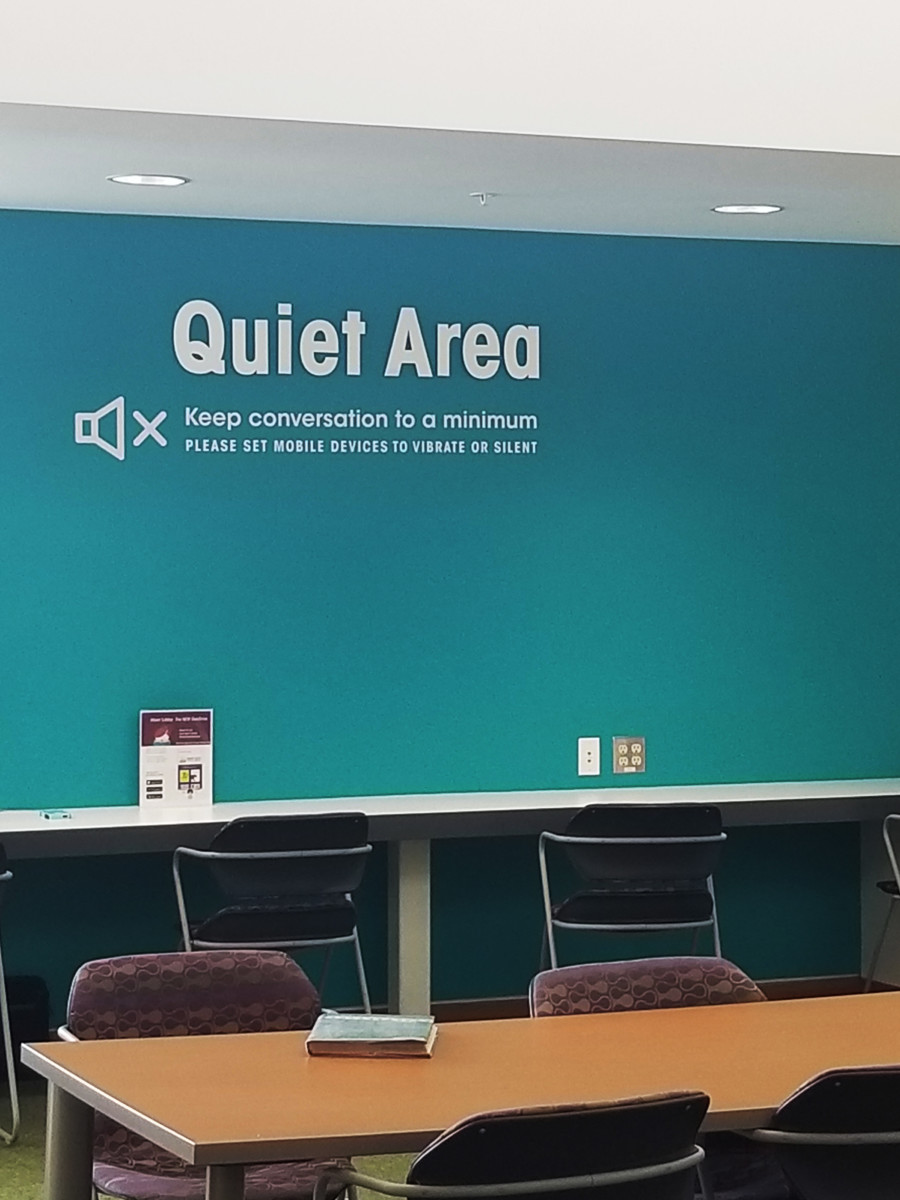
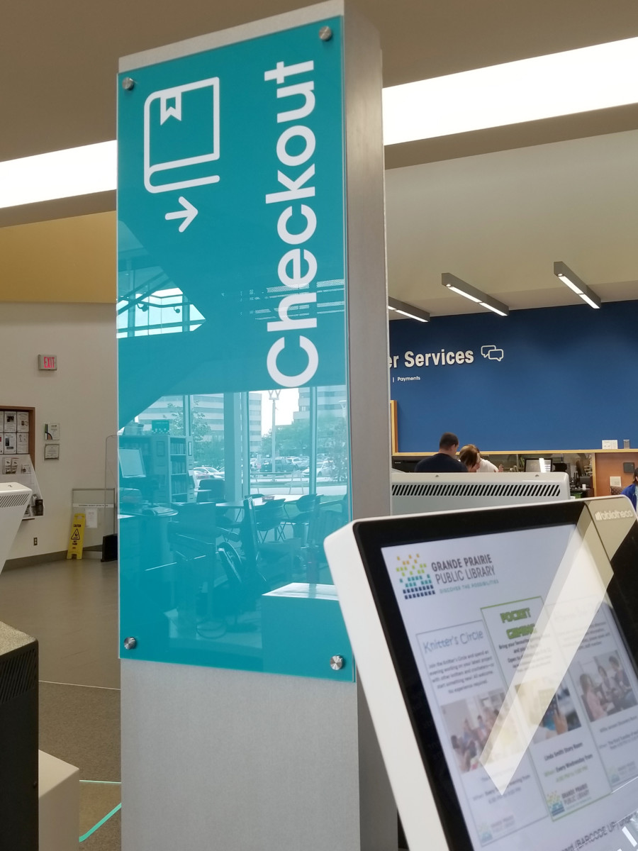
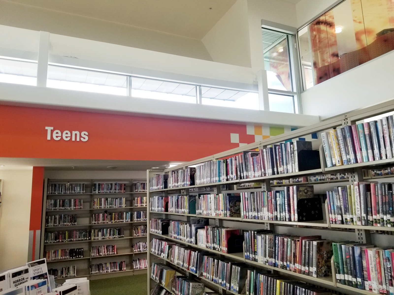
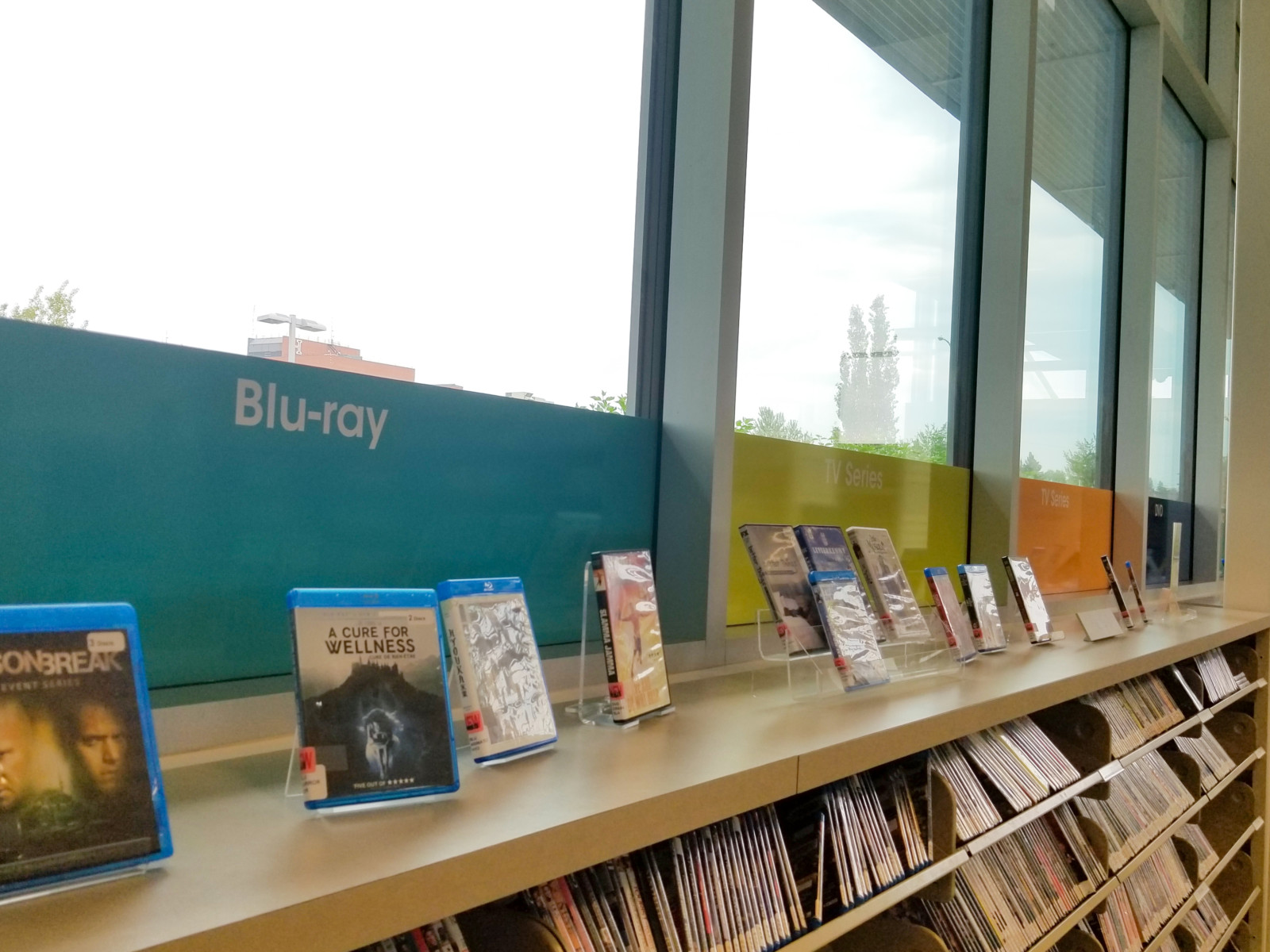
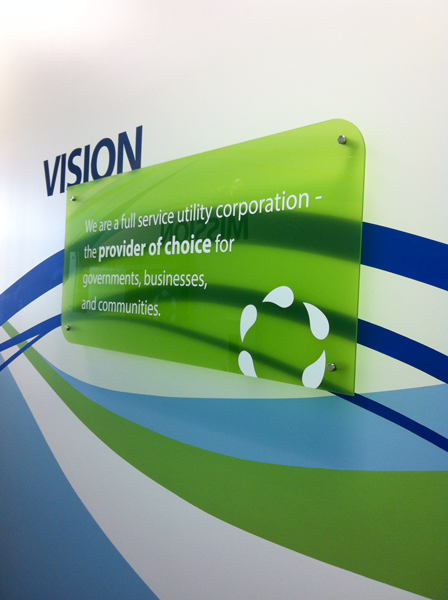
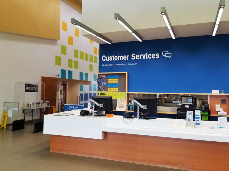
Wayfinding signage is one of the best things you can do for a large space. Not only does it help customers to navigate, but it’s also a perfect opportunity to show off your brand. The Grande Prairie Public Library wanted to upgrade their white walls and grey wayfinding signs to match their brand: energetic and bright. imageDESIGN was excited to inject colour into the space while also helping customers get around.
We designed and mocked-up painted walls, new signs, and tower displays. Working with local painters and printers, we were there every step of the way to bring the brand to the space.
Crouse’s Cleaners
graphic / print
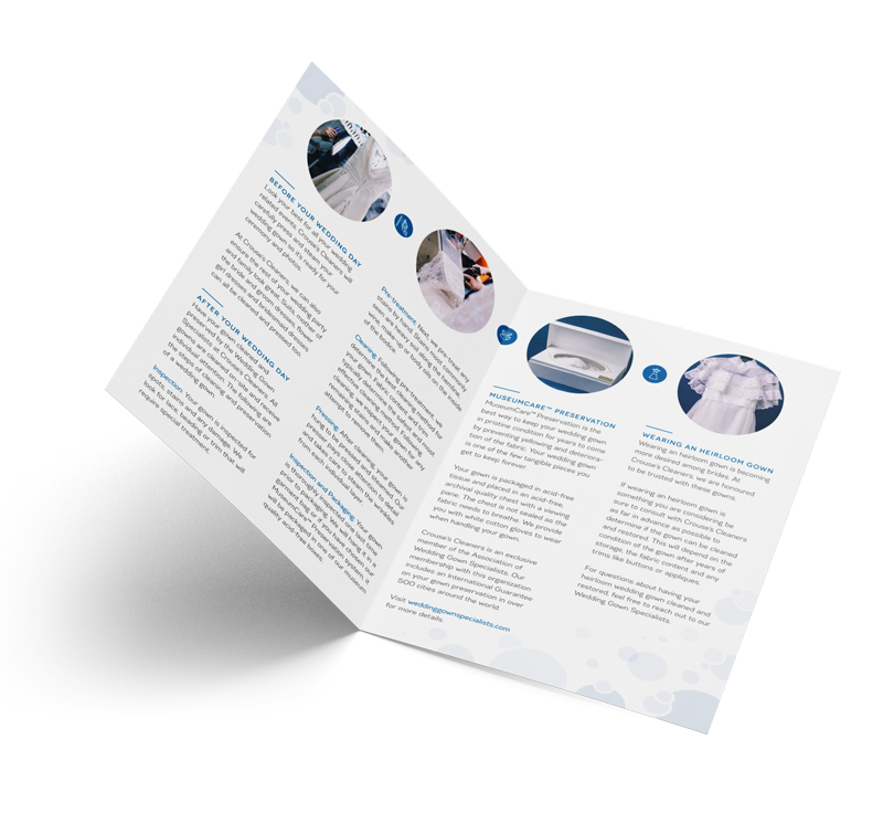
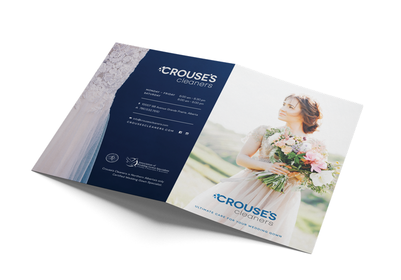
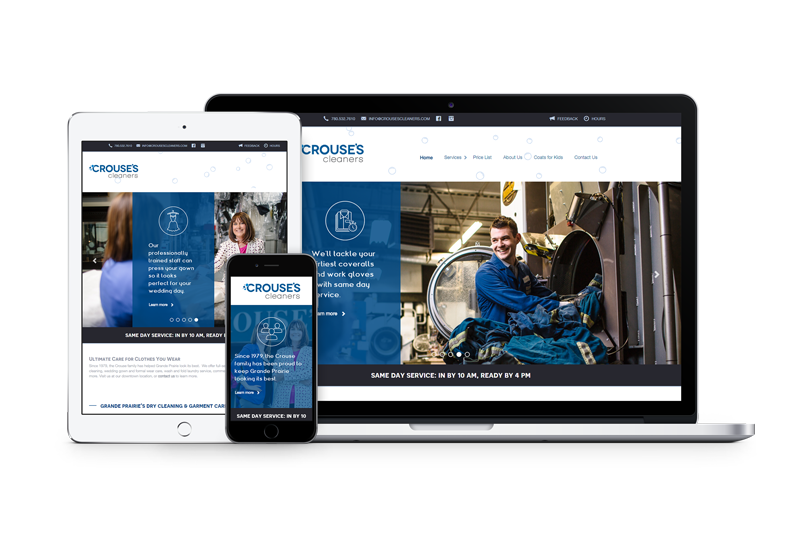
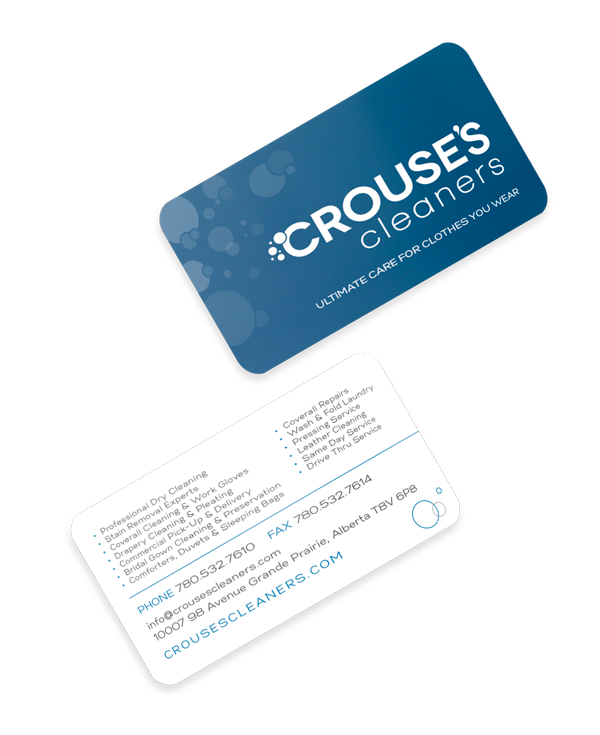
Crouse’s Cleaners has been a staple in the city since 1979, keeping Grande Prairie looking its best with exceptional cleaning services. We were excited to have the opportunity to refresh their brand. imageDESIGN created their new logo, keeping the Crouse’s staple blue, but cleaning up the text and icon to feel more modern. After, we worked on a new website, business cards, and printed promotional materials. We even created the initial look for their exterior building renovations!
The Helen Rice Book
print / publications
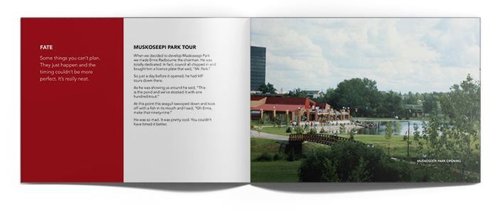
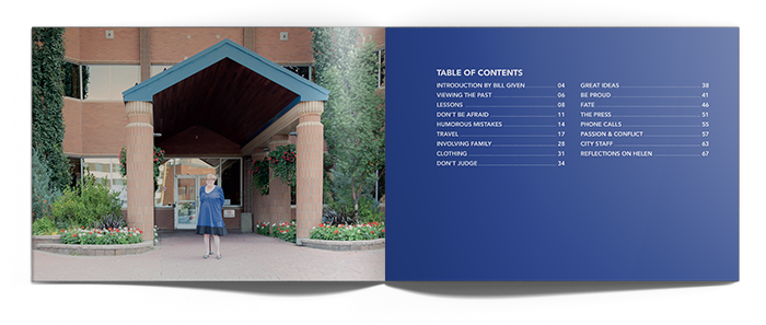
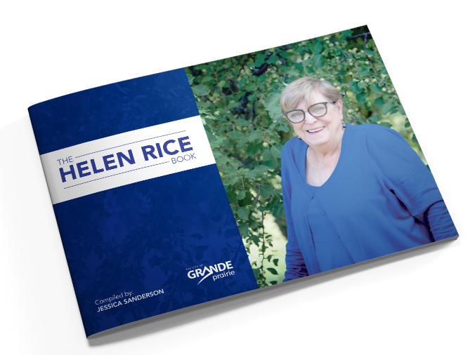
After nearly 40 years of service, city councillor Helen Rice announced her retirement from Grande Prairie City Council in 2017. The City of Grande Prairie wanted to commemorate Helen, while also capturing some of her unique experiences for future counselors. The result is a collection of short stories from Helen herself, compiled by local writer Jessica Sanderson. The stories include advice, anecdotes, and insight into working on city council. imageDESIGN created the design of the 80-paged book, keeping it clear and to the point—just like Helen.
GPRC Vital
digital print / graphic / print
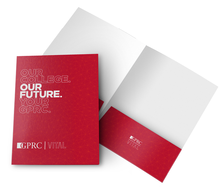
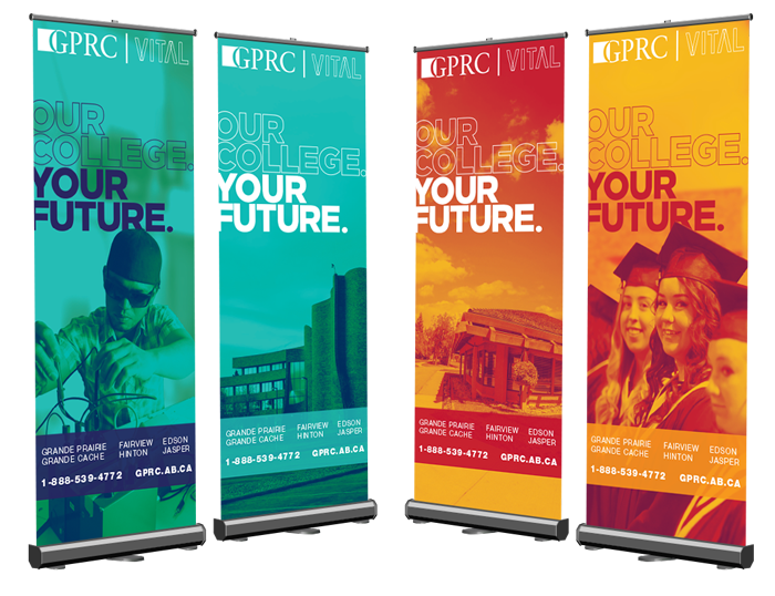
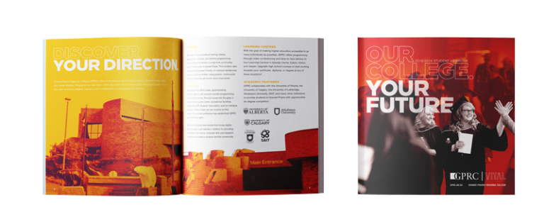
Our College. Your Future. Grande Prairie Regional College (GPRC) is a vital piece of our community. When GPRC wanted a refresh that built on their existing Vital campaign, imageDESIGN worked with them to create an engaging, consistent brand.
This brand included two variations for the campaign’s look. One is bright, colourful, and energetic look aimed at recruitment. The other sticks to GPRC’s traditional colour palette with a more corporate. The design has the flexibility necessary to work across departments for years to come. For this brand, we’ve completed a viewbook, folded information cards, advertisements, billboards, banners, booklets, folders, sandwich boards, social media templates, flyers, posters, postcards, promotional materials, and much more!
MD of Greenview
digital print / graphic / print
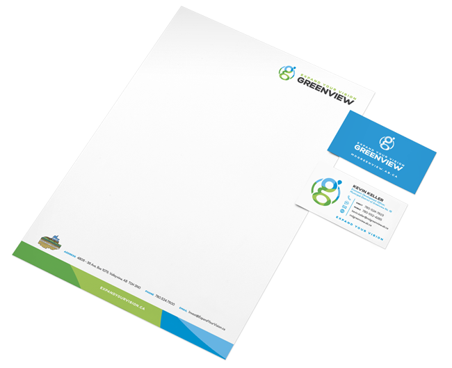
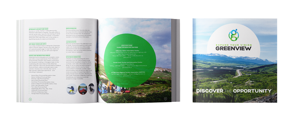
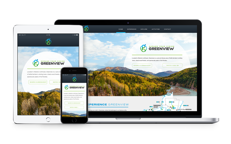
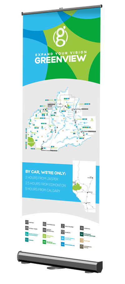
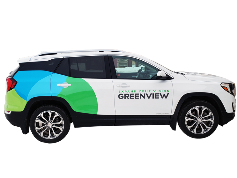
Expand your vision. This slogan promotes the Municipal District of Greenview in its tourism and economic development strategies. Before creating the brand, the project started with a survey of Greenview’s target market. The results were used to make an identity that speaks to the vast potential and possibilities in the region. Following the logo, imageDESIGN made a series of materials for the brand to launch the new identity. This includes trade show displays and banners, a stationery set, a fold-out map, an industry specific booklet, presentation slides, a tourism website, brand strategies and guidelines books, and social media graphics—whoo, that was quite the mouthful!
Downtown Grande Prairie
graphic / print
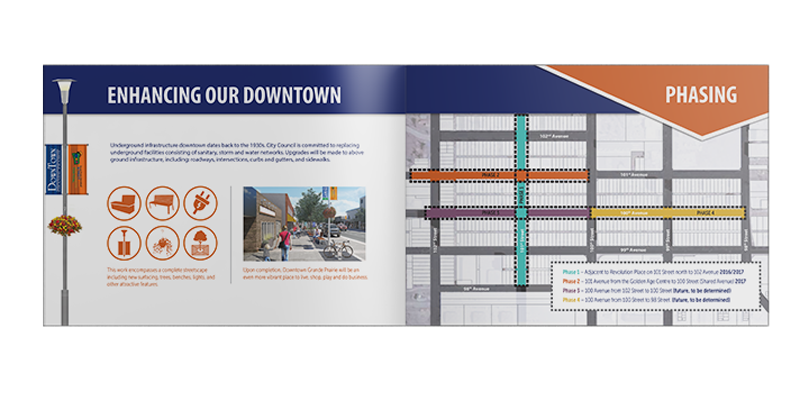
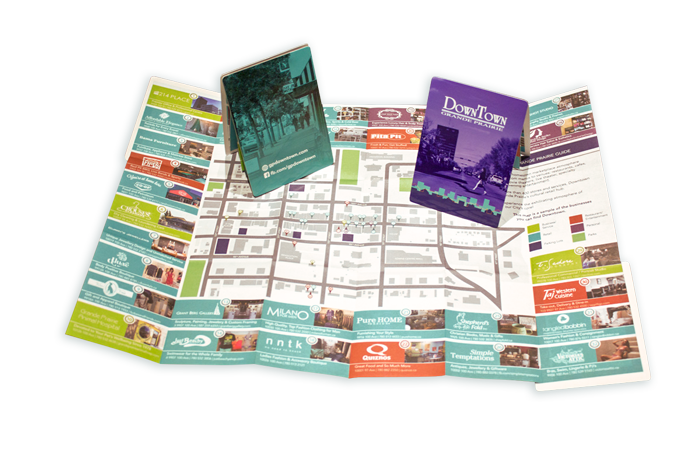
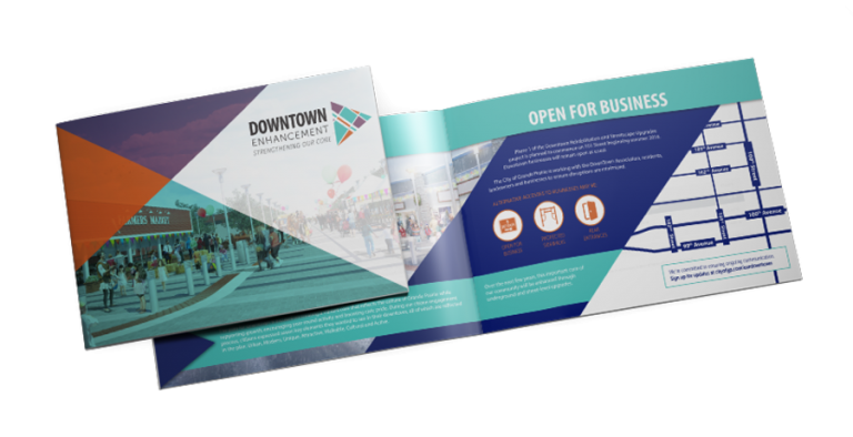
Even when undergoing a major streetscape upgrade, there is plenty to do in Grande Prairie’s downtown core! To show what the enhancement project included, we worked with the City of Grande Prairie to create a booklet that detailed key information of the design and phases of construction. Then, to showcase what is available in our city, we created an easy-to-use map for the Grande Prairie Downtown Association. The front features a map with just some of the many businesses located downtown, while the back is dedicated to two initiatives to encourage exploring the area on foot.
Search and Rescue Alberta
web / webPREMIERE
Through the experience of working with TSR Technical Search and Rescue, we had the opportunity to redesign the website for Search and Rescue Alberta. The webPREMIERE design was decluttered and given room to breath, with simple navigation and organization so information is easy to find. The area of operations page is presented two ways: an interactive map of Alberta as well as a list view.
Crosslink
web / webPREMIERE
Wanting a refresh to their previous website, Crosslink gave us the key criteria of more organization, easy navigation, and a cleaner, brighter design. Taking those necessary requirements, imageDESIGN developed a fresh, current webPREMIERE site. For easy display of information, Crosslink’s site has development maps, an embedded magazine, and property searches.
Grande Prairie Gymnastics
web / webPREMIERE
After working on the Grande Prairie Gymnastics brand – including logos for each of their divisions, business cards, and exterior and interior signage – we continued on with a webPREMIERE site that showcased the vibrancy of the long-running organization. Each program page is colour coordinated to match their branding, making the pages feel unique.
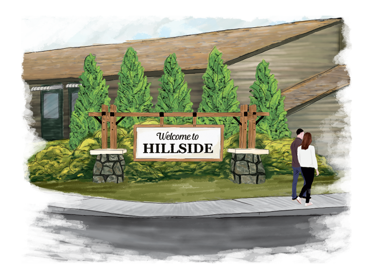
City of Grande Prairie - Hillside
graphic
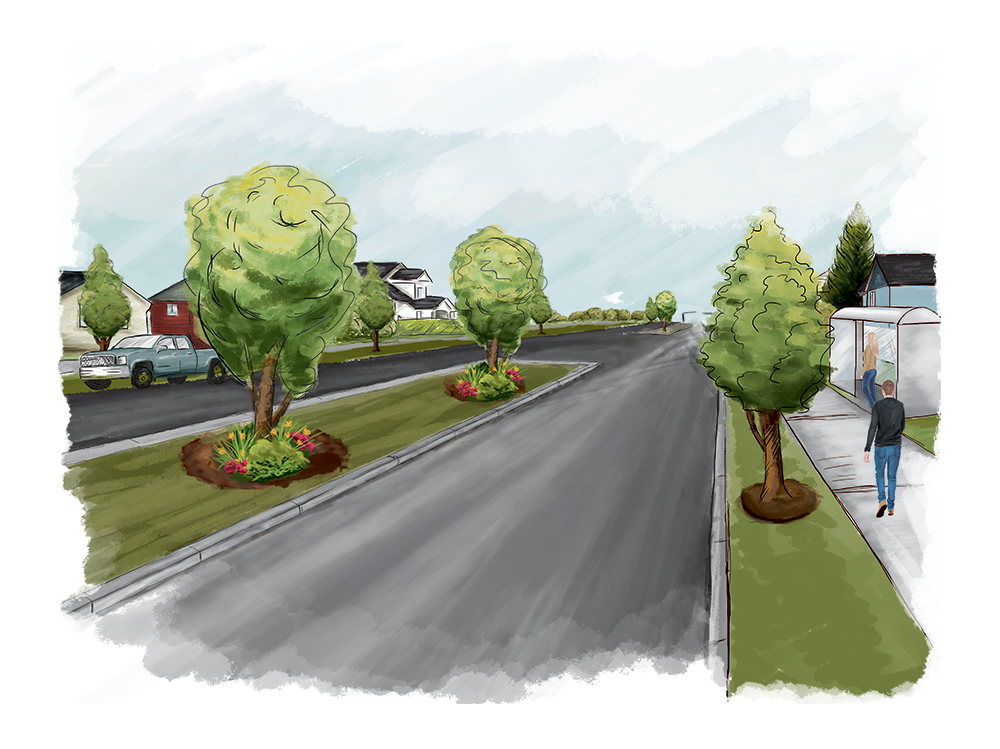
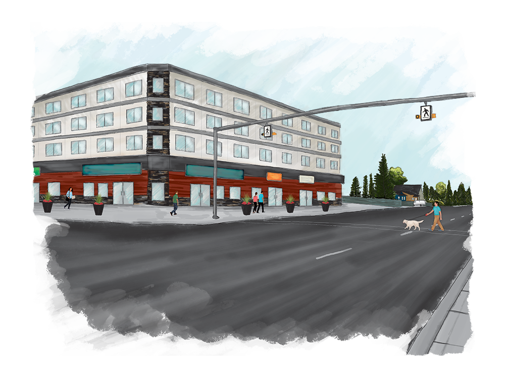
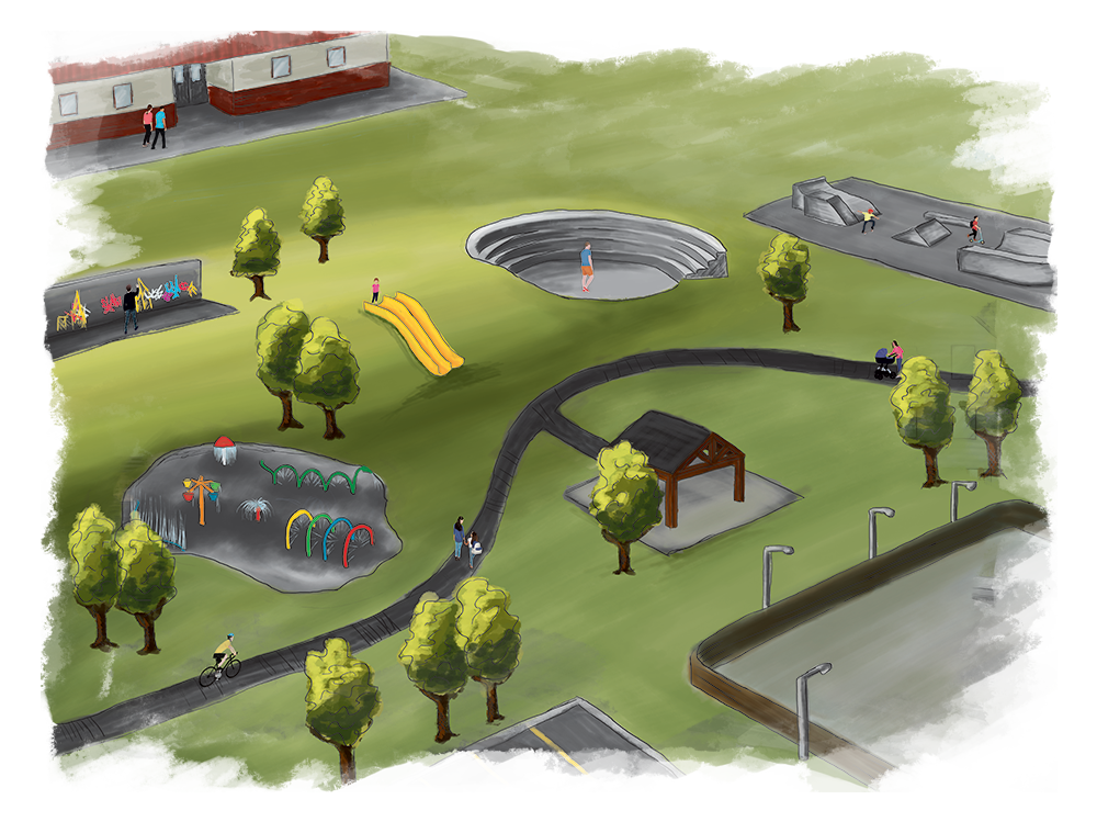
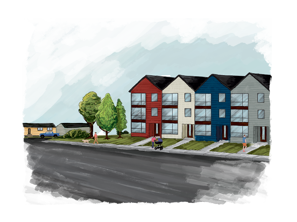
To give the public an idea for what the development in the neighbourhood of Hillside might look like, the City of Grande Prairie wanted a series of illustrations created. We were happy to help design a series showing the potential of what a piece of our city could be! imageDESIGN chose to use a sketched look for the rendering series, since they are concepts. This way, people wouldn’t focus too heavily on details and finishes that hadn’t been decided on.
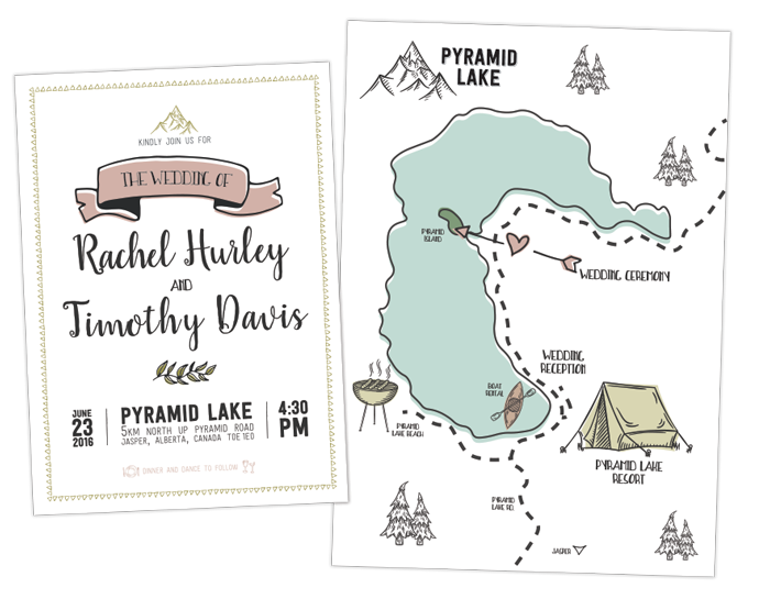
Wedding Invites
digital print / print
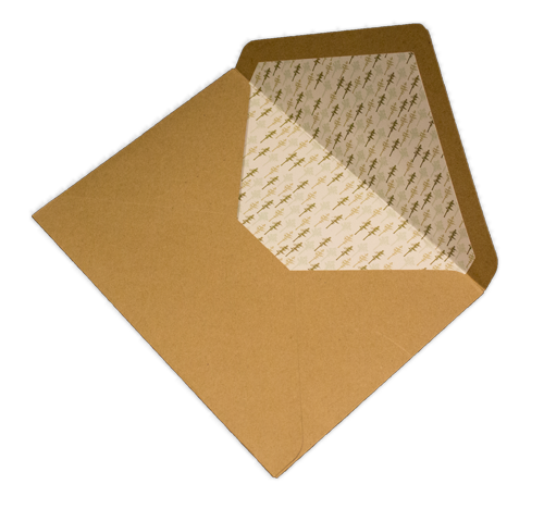
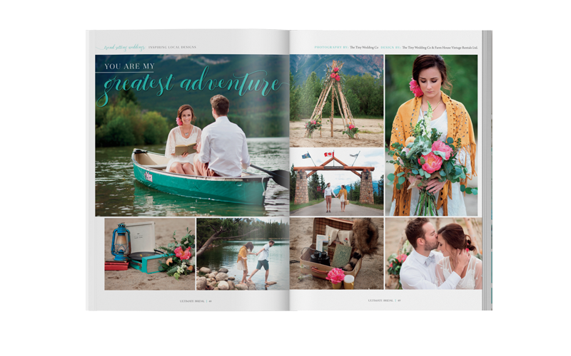
Originally designed for a retro, camping themed photo shoot for the Ultimate Bridal magazine, this wedding invite has gotten quite a lot of attention from local brides-to-be! We love the playful, casual look of this stationery set, from the tent diecut RSVP, to the charming map showing the highlight locations, to the custom envelope and liner.
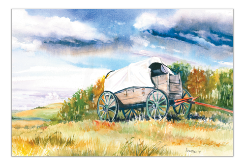
Louanne Hart Prints
print / wide format print
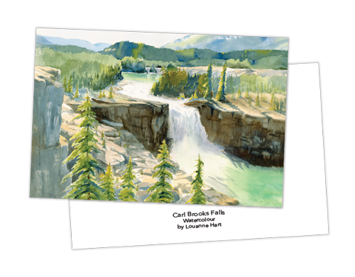
imageDESIGN has worked with hundreds of local artists to reproduce their artwork. One such artist is Louanne Hart, a longstanding member of the Grande Prairie art community. We colour matched the reproductions to be as close to the original pieces as possible, had Louanne confirm the test prints, produced the copies, and had them framed. Louanne has also ordered art cards, which make a great gift!
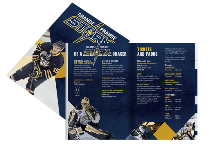
Grande Prairie Storm
graphic
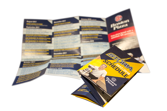
imageDESIGN had a lot of fun creating sporty, dynamic visuals for the marketing and promotion of the Grande Prairie Storm junior hockey team. After starting off with a logo update for their anniversary that maintains the spirit of the current jersey logo, we designed schedules, pocket books, posters, social media posts, gameday sheets, and their program.
Deeproot Homes
graphic
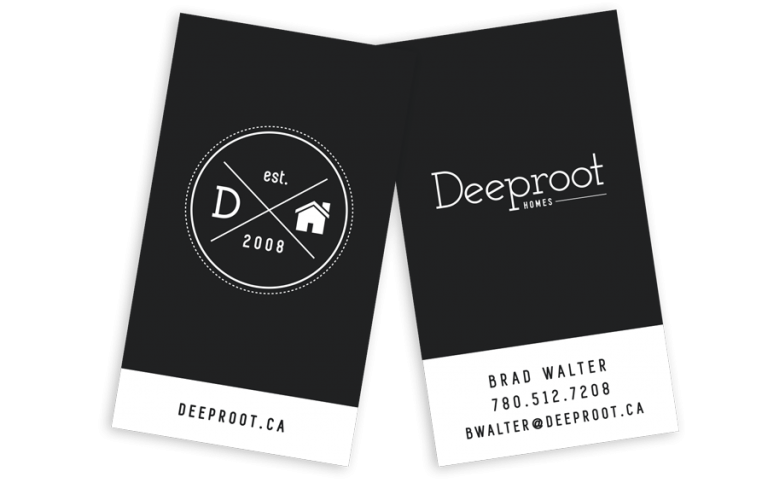
Deeproot was looking to make their logo feel more approachable and casual, and they chose us to create their vision. With a hipster direction in the client’s mind, a minimalistic badge was created to pair with a new wordmark. Keeping things simple and clean, a black and white business card pairs nicely with the logo and preexisting website, also designed by imageDESIGN.
Ramona's Pizza
digital print / print
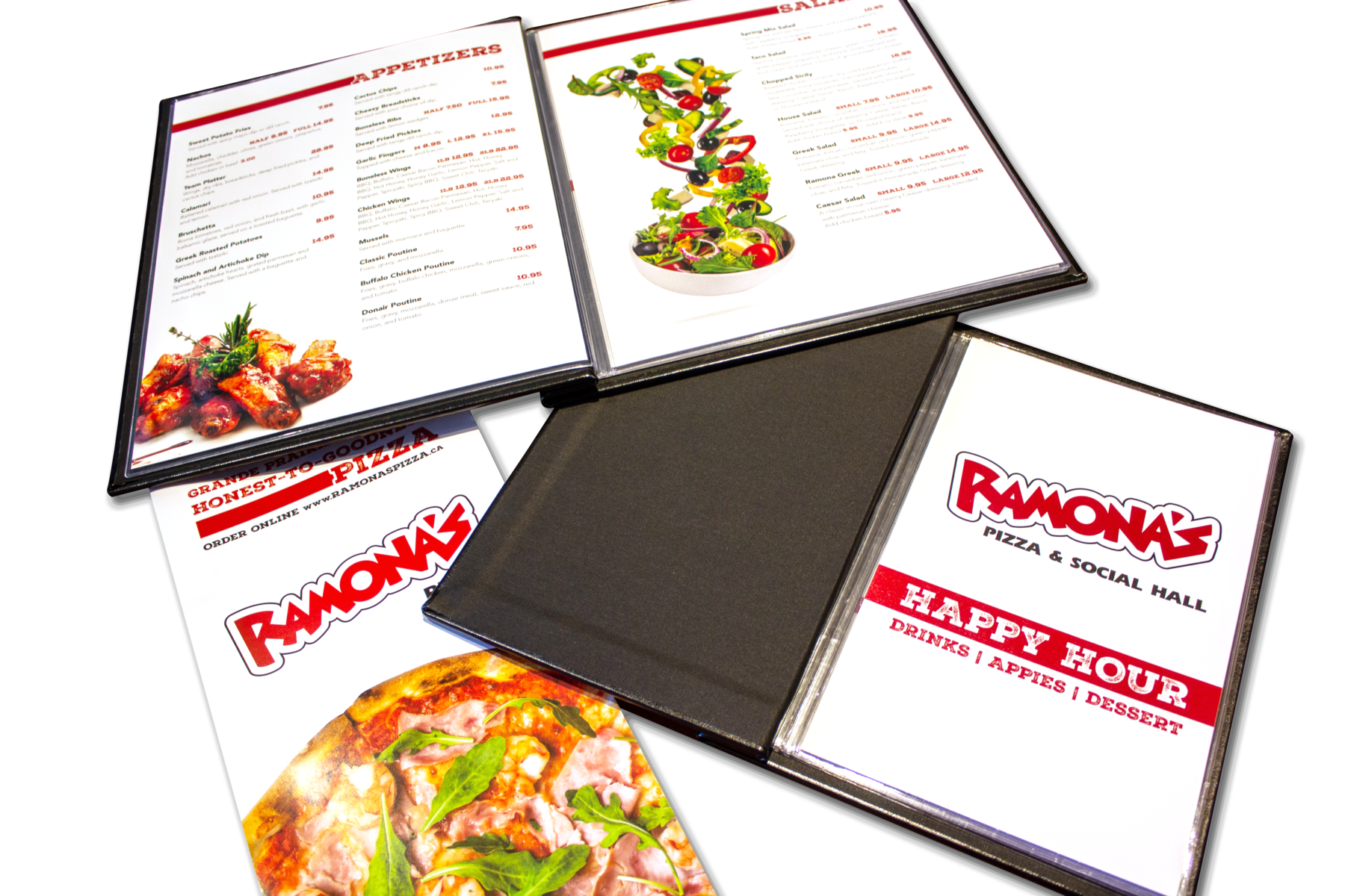
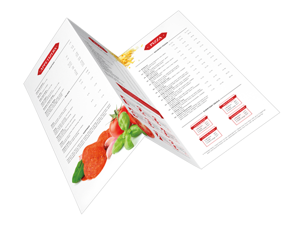
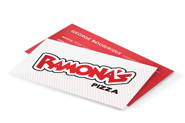
Ramona’s Pizza was looking for a menu design to tie into their new logo and website, so they came to us! We laid out the menu with visual elements breaking up the extensive options, and interpreted special items in unique ways. With our quick inhouse turn-around, we’re able to make sure our client doesn’t run out of menus! Also designed for Ramona’s was an overhead permanent sign menu for their second location and business cards.
Polar Energy Solutions
print / wide format print
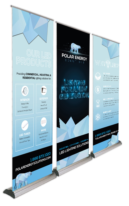
imageDESIGN has worked on the brand of LED company Polar Energy Solutions since they were founded in 2013. Besides designing their logo, business cards, website, deliverables, sales packages, and vehicle graphics, imageDESIGN created a series of banner stands for use at trade shows. With the icy look and clean, eye-catching design, the client got quite a bit of attention!
Grande Prairie & District Chamber of Commerce
print / special print
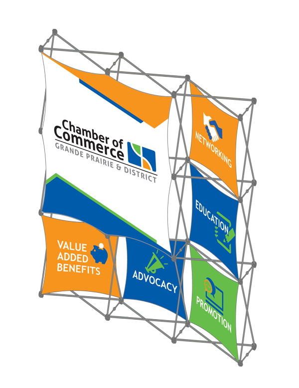
The Grande Prairie & District Chamber of Commerce is a voice for businesses of all shapes and sizes. They wanted a bold, graphic trade show display that would showcase their values. imageDESIGN designed a display that allows the small panels to be swapped out with new graphics. This makes it very flexible – instead of printing a whole new display to show a different message, the Chamber can easily change out one, two, or however many panels they want.
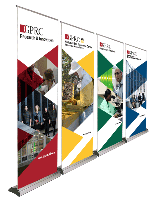
GPRC Research and Innovation
print / wide format print
When GPRC Research & Innovation was looking to increase visibility of their department, to tie their different teams together, and catch students’ attention, they chose to work with imageDESIGN based on past experience working with our design team. The series of banners was the first step in their new look and sets the tone for an inviting, modern brand.
Jack Ouellette
web / webPREMIERE
Continuing their branding with us, the Jack Ouellette team wanted a webPREMIERE that would flow with the rest of their materials. With an easy to use property search, social media stream, and convenient mortgage calculator, the Jack Ouellette site offers a lot of desirable features to viewers. Since the team is made of three key realtors, we developed a rotating logo to cycle through the trio.
Philip J. Currie Dinosaur Museum
web / webPREMIERE
Looking to update their previous website to have more of a wow factor and add features that they were lacking, Currie Museum chose imageDESIGN to elevate their site to meet and exceed standards set by modern museums. There are plenty of features on the webPREMIERE site: upcoming events calendar, rotating sponsors, social media stream, gift shop, French translation, and forms.
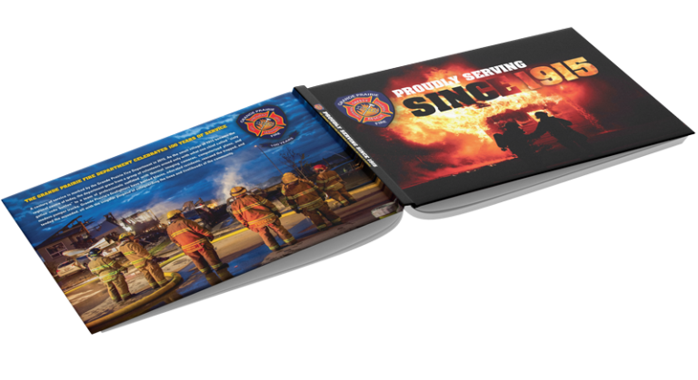
Grande Prairie Firefighters
publications
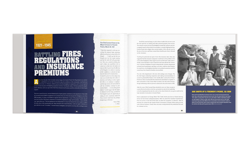
To commemorate the 100th anniversary of the Grande Prairie Fire Department, a chronology of the Department was created. Collaborating with the GPFD, writer Daryl White, and local photographers, imageDESIGN was proud to be selected to design this historic book. We approached the design with the intention of pairing the old with the new: archived images with clean, present-day elements.
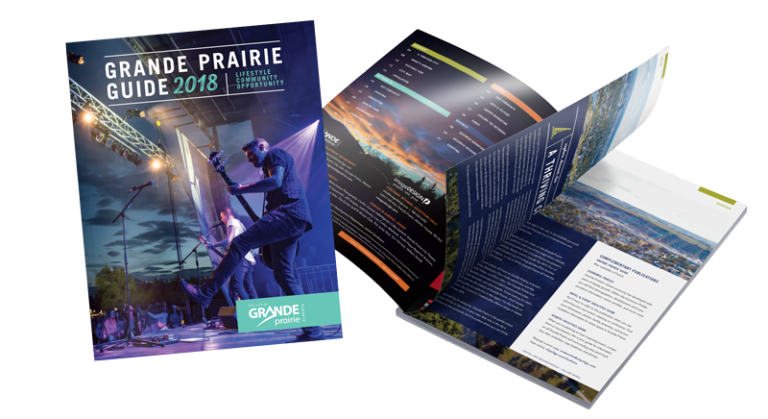
Grande Prairie Guide
publications
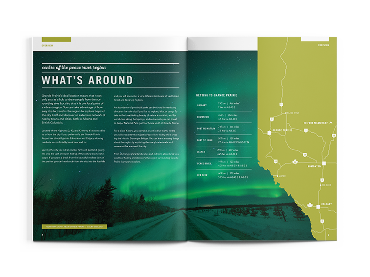
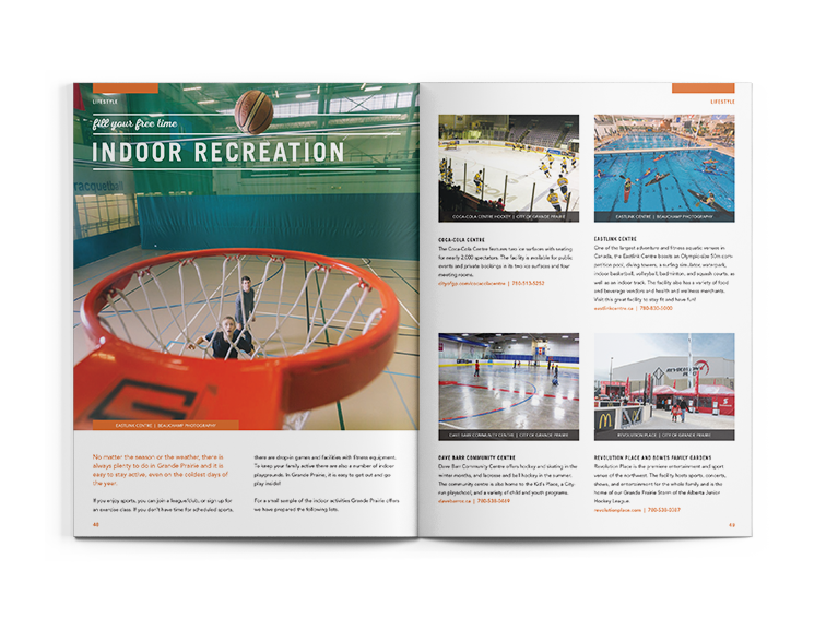
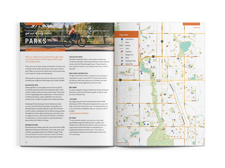
The Grande Prairie Guide (formerly the Relocation Guide) offers extensive information to people moving to Grande Prairie. The Guide shows how our city is an excellent place to live, work, play, and do business. imageDESIGN is both the publisher and designer of the Guide and works annually with the City of Grande Prairie to create this invaluable magazine. We also design the Economic Profile and the Facilities Guides, which are complementary publications to the Grande Prairie Guide.
https://issuu.com/cityofgp/docs/2021_gp_guide_-_english
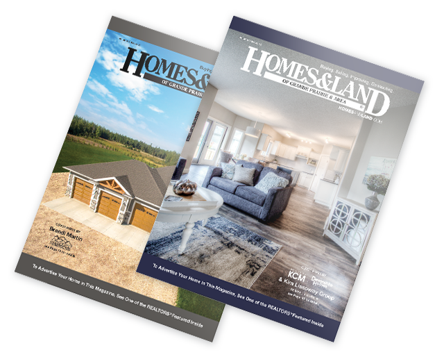
Homes & Land
publications
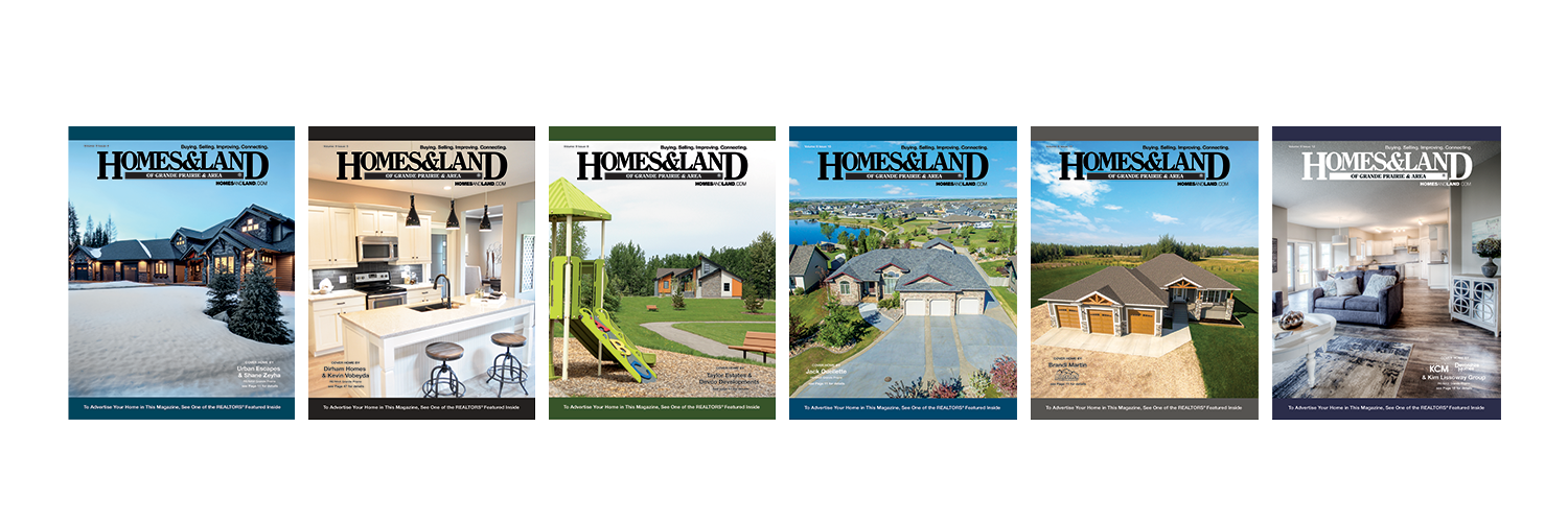
Homes & Land is a real estate network that covers thousands of communities across Canada and the United States. We’ve been the designers of the Homes & Land Grande Prairie Magazine since 2008, creating a new magazine every four weeks. Part of the process is working with local realtors and builders to create their advertisements and branding.
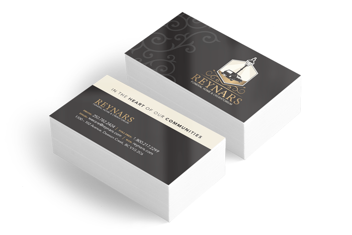
Reynar's Funeral Home
graphic
The owners of Reynars needed a flexible brand that could be applied to both of their businesses: Reynars Funeral Home & Crematorium and Beaverlodge Funeral Service. With imagery in mind – an antique lamppost and a hearse – imageDESIGN worked out a design that combines the elements into a logo that would feel current and be a strong launching point for future materials.

Sherri Toerper
graphic
Sherri Toerper wanted to steer clear of the classic imagery for realtors when she started her brand: no houses and no keys. She asked for a logo that was modern, clean, bold, and of high quality – and we delivered! Following her logo design, we designed business cards, advertisements, email signature, Facebook cover and profile graphic, and webPREMIERE website.
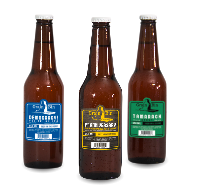
Grain Bin Brewing Company
special print
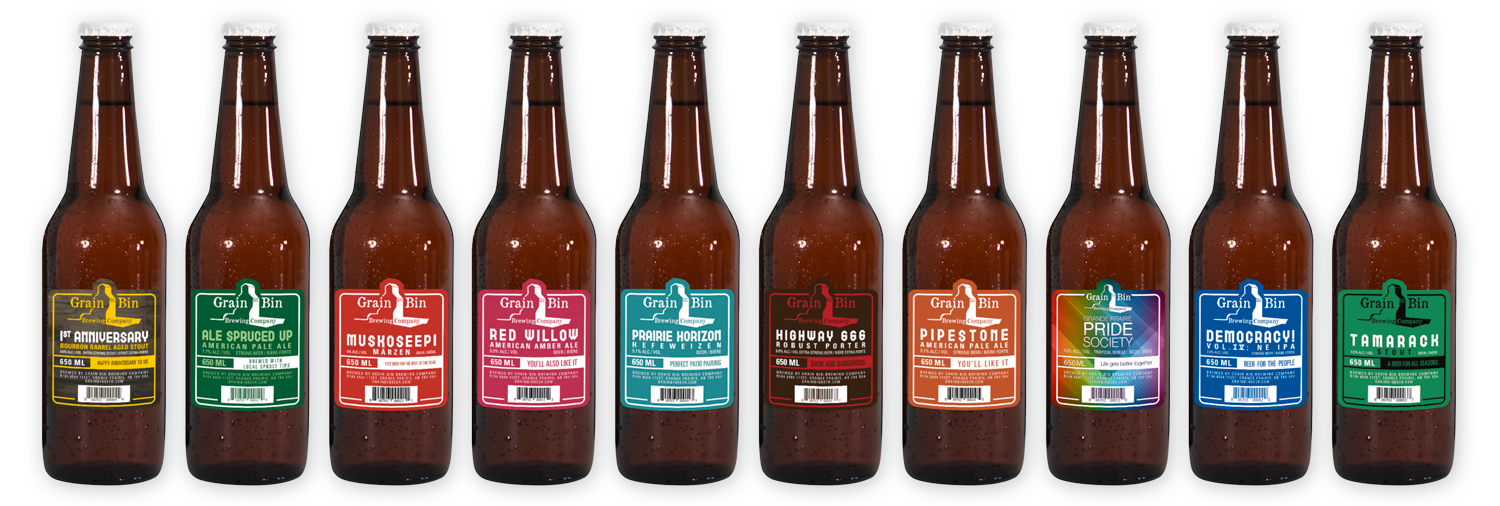
Grain Bin Brewing Company is a Grande Prairie craft brewery offering rotating, locally inspired seasonal beers as well as a few standards. When looking for labels that could be applied to their wide variety of brews, imageDESIGN pitched a clean design solution that looks great on the shelf. The range of colourful labels is as extensive as Grain Bin’s beer selection!

Heat Lubricants
print / special print
HEAT Lubricants is a local line of products specially formulated to work in the harsh Canadian north. To refresh their design to make a bigger impact in the market, imageDESIGN created a bold brand that definitely stands out from the competition. The labels for their line of products – with bold colours, strong typography, and imagery of flames – definitely grab attention on the shelves.
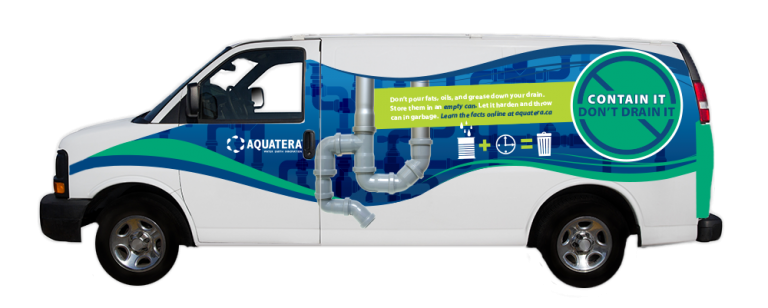
Aquatera - Vehicle Wraps
special print
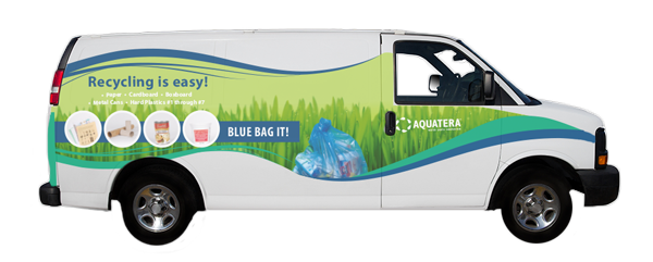
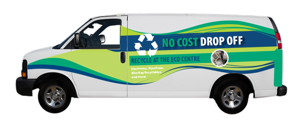
imageDESIGN has enjoyed a working relationship with Aquatera for years and has completed numerous projects for them, including vehicle wraps for multiple vans. Because different campaign messages appear on all sides of the vehicles, imageDESIGN created a border that tied into their overall brand, which kept a consistent element throughout.
Stat Safety
web / webPRESENCE
Sometimes, companies just want to get a professional presence online. After getting their logo designed by our team, the webPRESENCE single page option was perfect for Stat Safety Training Inc. The site gives all the key information users might need about the company, while also including an optional calendar. As with all our websites, the site is fully mobile responsive!
K-Tec Industries Inc
web / webSTANDARD
K-Tec was looking for a website design that they didn’t plan on changing content often, so our webSTANDARD package was perfect for them. Taking the feel of their own marketing materials, our design is consistent with their preexisting brand while at the same time elevating and refining the look. As with all our offered packages, K-Tec is mobile responsive to view across all browsers!
Auto Trac
web / webSELECT
Auto-Trac Tire & Auto worked with imageDESIGN on creating its brand, which included a webSELECT website to replace their out of date site. We first worked with Auto-Trac to select the template that worked best for them and their needs. After that, we updated the the styles, retouched images, and placed content to best reflect their brand.
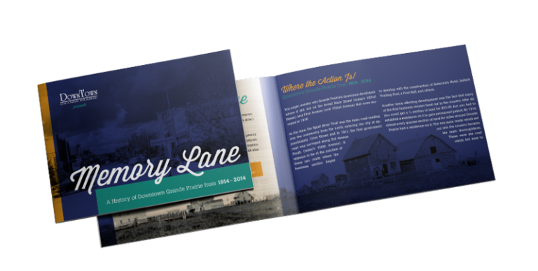
Memory Lane
design
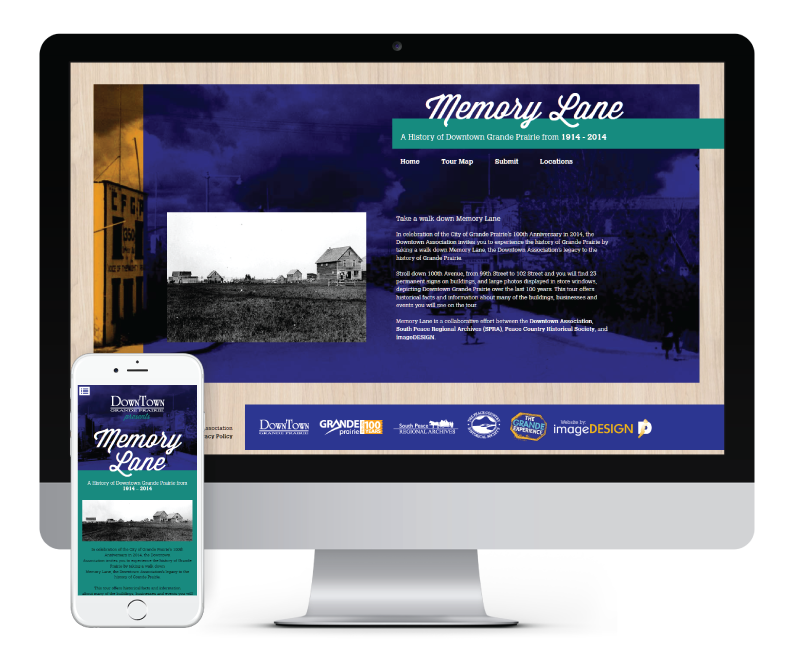
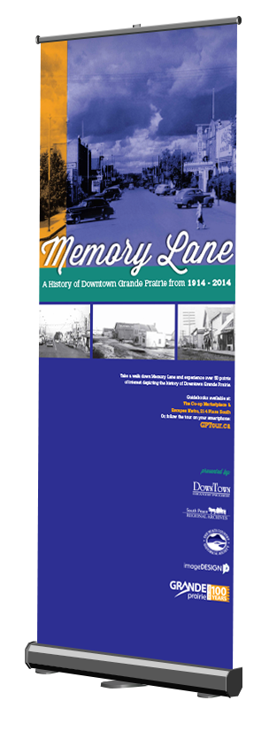
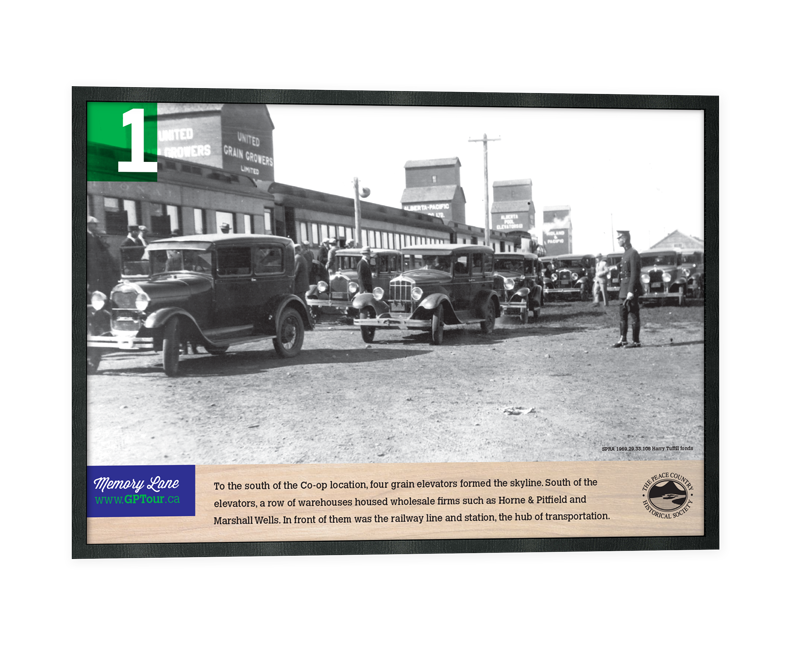
To ring in Grande Prairie’s 100th anniversary in 2014, the Grande Prairie Downtown Association wanted a legacy project that would recognize the history of the downtown core, while also encouraging locals and visitors to visit the area. imageDESIGN worked with the DTA, SPRA, and the Peace Country Historical Society to create the Memory Lane walking tour. We created temporary and permanent plaques, a guidebook, advertisements, posters, banners, bag stuffers, flagpole banners, and a website for the tour. So if you’re in Downtown Grande Prairie, check out Memory Lane!
Aquatera Interior Design and Wayfinding
special print
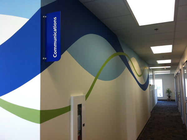
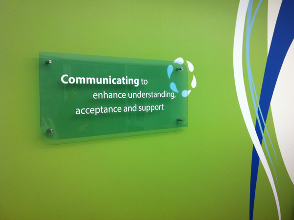
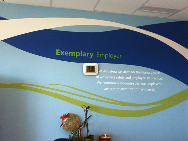
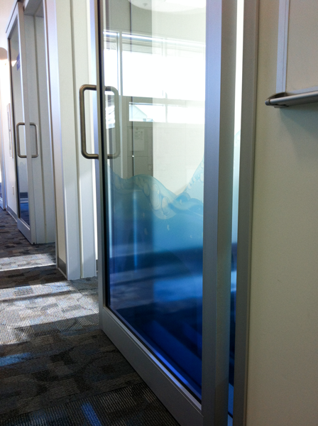
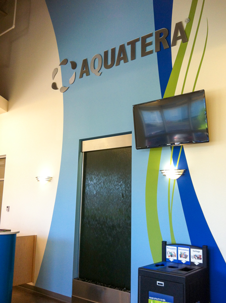
Aquatera provides Grande Prairie with water and wastewater treatment, garbage collection, and recycling services. They wanted to include the branding we developed in a number of their buildings, including their two-storey office in the city. imageDESIGN created vibrant environmental designs, wayfinding, plexiglass signs, window graphics, and painted wall murals. We partnered with a painter, who translated our design onto the office walls.
Grande Prairie Public Library
publications
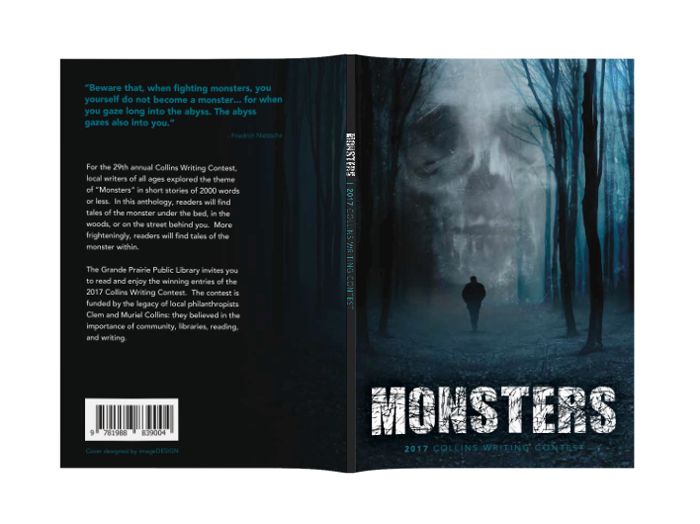
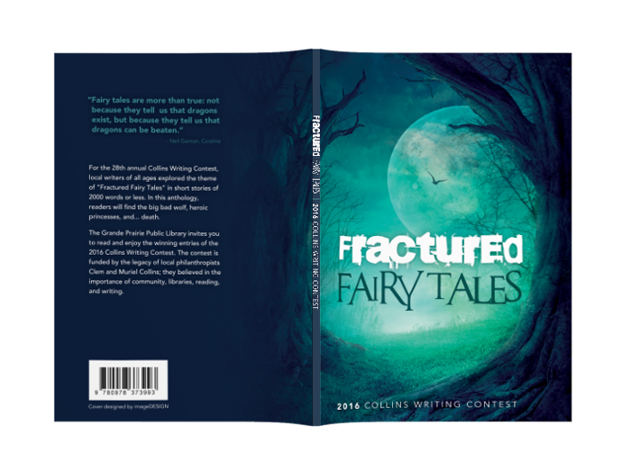
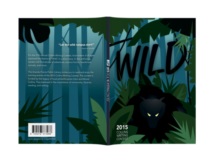
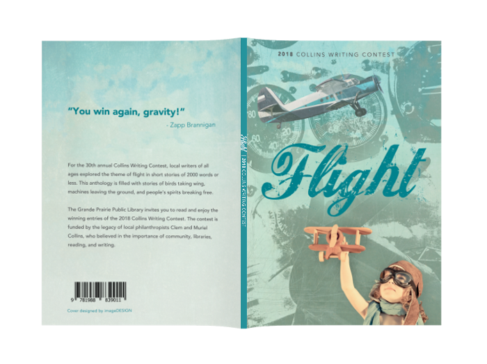
The Collins Writing Contest, organized by the Grande Prairie Public Library, supports and encourages local literary talent of all ages. For close to a decade, imageDESIGN has worked with the Grande Prairie Public Library to create the Collins Writing Contest anthology book. We typeset the winning stories and create the cover design based on the year’s theme.
South Peace Regional Archives Society
publications
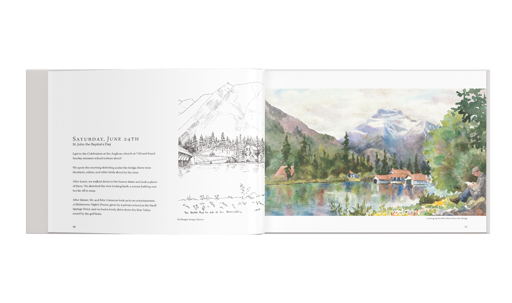
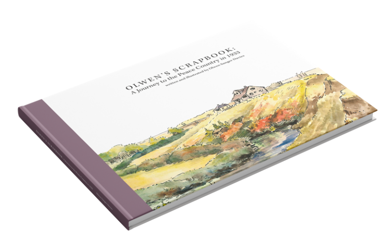
Olwen’s Scrapbook: A Journey to the Peace Country in 1933 is both an art book and journal documenting Olwen Sanger-Davie’s journey to Alberta. We worked together with the South Peace Regional Archives to create a coffee table book to allow Olwen’s beautiful artwork and story to be accessible to the public. As strong advocates for the arts, imageDESIGN encouraged in this reproduction beyond the design of the book: helping to arrange sponsorship, arranging a transcriber, and promoting the book.
Ultimate Bridal Magazine
publications
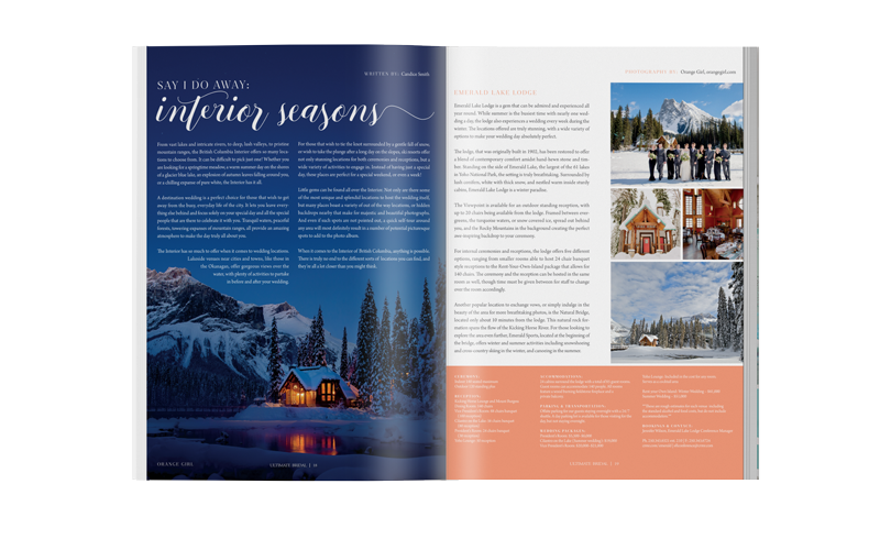
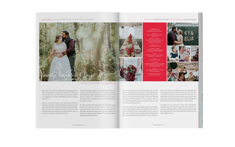
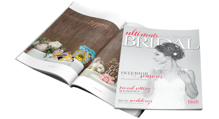
As the only regional wedding magazine published and distributed in Northern Alberta, British Columbia, and the Peace Region, Ultimate Bridal showcases regional talents, current wedding trends, and venues close to our home. imageDESIGN is both the publisher and designer of Ultimate Bridal. We send out a free annual issue every fall to wedding shows and local vendors. Pick up your free copy at wedding shows in the Peace region, and at the various vendors as shown in the magazine, and online at the website.

